How to read a crypto chart
Reading crypto trading charts is pretty important for anyone looking to get into crypto trading or investing. After all, these charts provide a visual representation of market data, enabling traders to make informed trading decisions.
Chart education video
Key takeaways
- Crypto trading charts, such as line charts, bar charts and candlestick charts, show how crypto prices and other information changes over time.
- Understanding how to read cryptocurrency charts for day traders is essential for analyzing cryptocurrency trends and determining price movements.
- Popular overlays and indicators on live crypto charts help traders make informed decisions.
- Noticing common bullish and bearish patterns is important for successful crypto trading and trend following.
- Using multiple indicators and backtesting strategies is important to improve trading approaches.

Why do you need to understand cryptocurrency market charts?
Reading crypto trading charts is pretty important for anyone looking to get into crypto trading or investing. After all, these charts provide a visual representation of market data, enabling traders to make informed trading decisions.
By analyzing price movements and patterns, traders can see market trends directly on the charts — whether bullish or bearish — and make predictions about future price directions. This helps determine the best times to buy or sell assets, as well as where to set different orders to protect the trades, such as stop-loss or take-profit orders.
Think of reading these charts like learning to read a map before a journey. Maps can help predict what the journey will look like. Just as a map helps navigate to a destination by showing the best routes and potential obstacles, crypto charts guide traders in navigating the market by highlighting trends and potential price movements.
However, it’s not as simple as reading a map when you sit down for a trading session — reading cryptocurrency charts is part of the (rather tricky) school of crypto technical analysis that requires a lot of practice and mastery.
Indeed, you’ll need to learn how to use charts to identify patterns, such as head-and-shoulders, double tops and bottoms and triangles, which can signal potential price movements. For instance, a head-and-shoulders pattern might indicate a trend reversal, while a triangle pattern could suggest continuing the current trend.
It doesn’t come easy, but at least after reading this article, you’ll have a better understanding of the basics of cryptocurrency charts. Welcome to a guide on how to read cryptocurrency charts for dummies.
Did you know?
Michael Novogratz, a former hedge fund manager and billionaire, started investing in cryptocurrencies in his 50s. After a successful career on Wall Street, Novogratz saw the potential in digital currencies and became one of the most prominent figures in the crypto world. His late entry into crypto trading shows that it’s never too late to embrace new financial opportunities and succeed in an emerging market.
Decoding cryptocurrency charts
One of the first things you likely notice when opening a trading platform is the option to change the type of chart displayed. Let’s start by defining the main types of charts and their common uses.
Different kinds of charts

Line charts
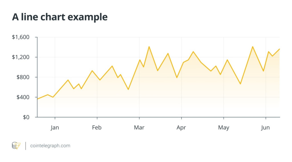
Line charts are the simplest type of chart used in cryptocurrency trading. They plot a line from one closing price to the next over a specified period. This type of chart is useful for identifying general trends and long-term price movements. However, they lack detailed information about intraday price fluctuations.
Check out the example below. The line moves up and down in response to price changes, showing the overall trend over time.
Bar charts
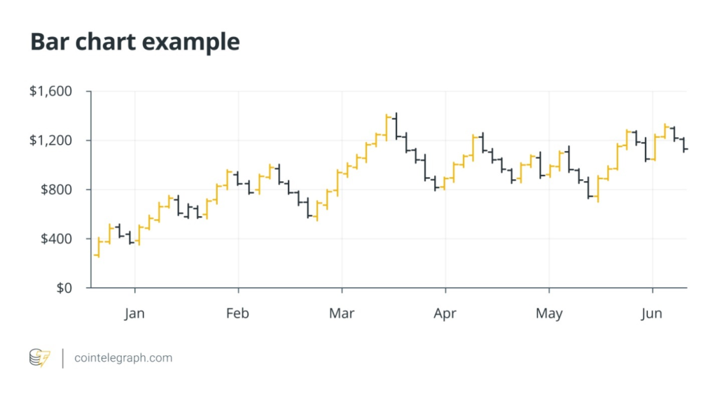
Bar charts provide more detailed information than line charts. Each bar represents a specific time period (e.g., one day, one hour) and displays the opening, closing, high and low prices for that period.
The top of the bar indicates the highest price, while the bottom shows the lowest price in that time period. A small horizontal line on the left of the bar represents the opening price, and a small line on the right represents the closing price. Bar charts help traders analyze the strength and direction of price movements over time.
Candlestick charts
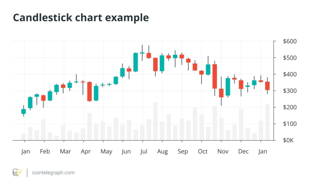
Candlestick charts are the most popular and widely used charts in cryptocurrency trading, likely as they provide the same information as bar charts but in a more easily understood format.
Each candlestick represents a specific time period and shows the opening, closing, high and low prices. The body of the candlestick is colored (typically green for up periods and red for down periods), making it easy to see whether the price closed higher or lower than it opened. The wicks at the bottom and top represent the lowest and highest prices in that period, respectively.
Crypto candlestick charts are valuable for identifying patterns and trends that indicate potential price movements in the crypto market.
Did you know?
Candlestick charts originated in Japan during the 18th century. They were developed by Munehisa Homma, a Japanese rice trader, to track the price movements of rice. These charts provided a visual representation of price trends and market sentiment, helping traders make informed decisions. Candlestick charts were later introduced to the Western world and have become a widely used tool in financial analysis.
Key components of a cryptocurrency chart
No matter which charts you choose, the timeframe is always an important aspect to consider.
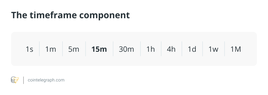
Common timeframes include one minute, five minutes, one hour, one day and one week. Choosing the right timeframe depends on your trading strategy and goals. Short-term traders may prefer shorter timeframes for quick-moving crypto chart analysis, while long-term investors might look for a broader trading perspective.
Price axis and volume axis
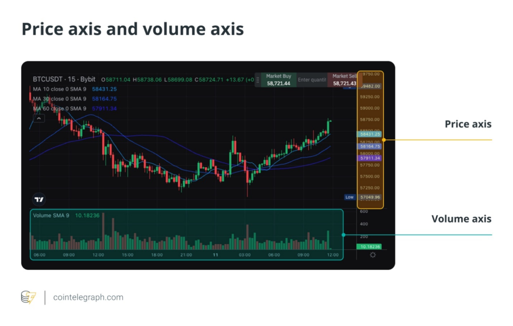
The price axis (usually the vertical axis on the right) shows the price levels of the cryptocurrency. The volume axis (usually the vertical axis on the left or at the bottom) displays the trading volume, which is the number of units traded during a specific timeframe.
High trading volume can indicate strong interest and potential price movement, while low volume might suggest a lack of interest or uncertainty in the market. In the example below, taken from Bybit, the trading volume is illustrated at the bottom of the graph, with an accurate volume indicator to the left of the bottom.
Cryptocurrency chart indicators and overlays
Indicators and overlays are tools used to enhance chart analysis. While overlays are applied directly on the price chart, indicators are typically displayed in a separate pane below the main price chart. They do not directly overlay the price action but provide additional information based on the price and volume data.
Think of indicators and overlays as tools for enhancing a photo. Overlays are like filters that are applied directly to the photo to change its appearance, adding effects like brightness or contrast directly to the image. They are also applied directly to the price chart to give a clearer view of the price action.
Indicators are like the histogram or metadata displayed below the photo, providing additional information such as exposure or color balance. They don’t change the photo itself but provide extra details to understand it better, just as indicators offer insights based on price and volume data in a separate pane below the main price chart.
Both may be accessed from dedicated menus, as showcased by the Bybit example below.
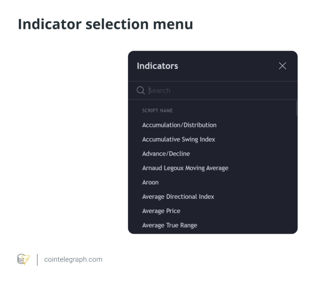
Every in-use overlay and indicator deserves a separate article, but it’s certainly worth getting your head around the most popular. Let’s go through a few.
Popular overlays
Things are about to get a bit technical, so make sure you have your thinking caps on!
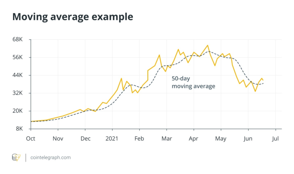
- Moving averages (MA)
Most notably, moving averages are used to smooth out price data and help identify the direction of a trend. Traders use moving averages to determine the trend direction and potential points where the price might reverse. They are also helpful in determining support and resistance levels.
- Bollinger Bands
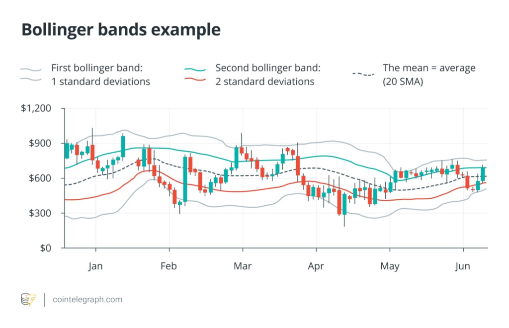
Bollinger Bands consist of three lines: a middle band (a simple moving average, or SMA) and two outer bands representing standard deviations from the middle band.
The middle band is typically set to a 20-period average. This line represents the average price over a specific number of periods (e.g., days) and serves as the baseline for the Bollinger Bands.
The two outer bands are positioned at a certain number of standard deviations (usually two) above and below the middle band. A standard deviation measures price volatility, indicating how much the price deviates from the average.
When the price gets close to the upper band, the market may be overbought. Conversely, when the price approaches the lower band, the market may be oversold. Traders use Bollinger Bands to anticipate price reversals or continuations.
- Fibonacci retracement
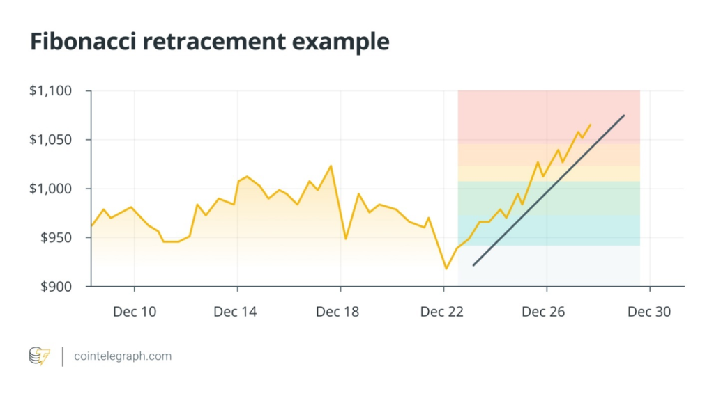
Lastly, Fibonacci retracement uses horizontal lines to indicate potential support and resistance levels at key Fibonacci ratios: 23.6%, 38.2%, 50%, 61.8% and 100%.
This tool is based on the Fibonacci sequence and helps traders identify possible reversal levels. By using Fibonacci retracement levels, traders can predict where the price might find support or resistance after a significant move, aiding in their entry and exit decisions. This tool ought to be applied manually, and it can be done through the “drawings” tab on Bybit, for example.
Popular indicators
Let’s move on to indicators. Keep in mind that indicators are typically shown below the main price chart and do not directly overlay the price action.
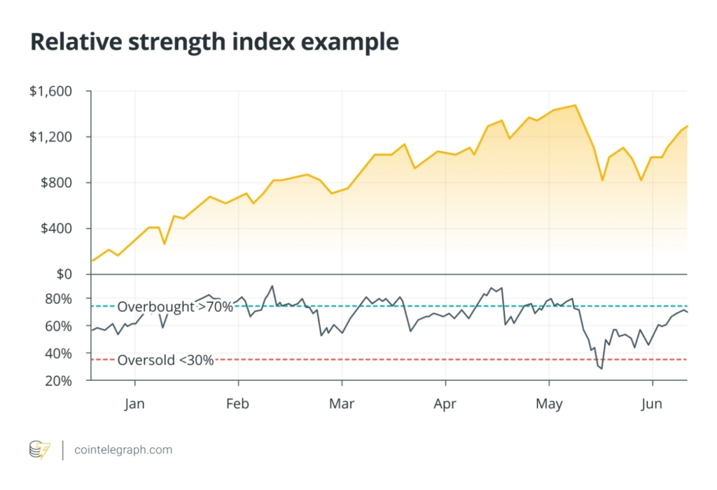
- Relative strength index (RSI)
The RSI measures the speed and change of price movements to identify overbought or oversold conditions. It gives a value between zero and 100. When the RSI is above 70, it indicates that the market might be overbought. When it is below 30, it suggests that the market might be oversold. Traders use RSI to predict potential reversals and assess the strength of a trend.
- Moving average convergence divergence (MACD)
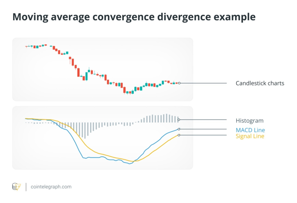
The MACD consists of three components: the MACD line (the difference between the 12-day exponential moving average, or EMA, and the 26-day EMA), the signal line (a nine-day EMA of the MACD line), and the histogram (which shows the difference between the MACD line and the signal line).
MACD is a momentum indicator that helps identify trend direction and potential reversals. When the MACD line crosses above the signal line, it’s a bullish signal, suggesting that prices might rise. When the MACD line crosses below the signal line, it’s a bearish signal, indicating that prices might fall. The size of the histogram indicates the strength of the trend.
- Stochastic oscillator
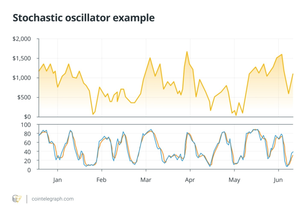
Lastly, the stochastic oscillator compares a particular closing price to a range of prices over a certain period to determine momentum. This indicator ranges from zero to 100. Readings above 80 indicate overbought conditions, while readings below 20 indicate oversold conditions. Traders use the stochastic oscillator to identify potential reversal points, helping them decide when to buy or sell.
Choosing the right overlays and indicators to use as a trader depends on your trading style, goals, and the type of market analysis you prefer.
How to use charts to identify patterns
There are around 30-40 well-recognized patterns when it comes to crypto trading.
While you’re not expected to know all of them, identifying chart patterns is crucial in technical analysis, helping traders anticipate potential price movements. Here are some common patterns to look for:
Head-and-shoulders pattern
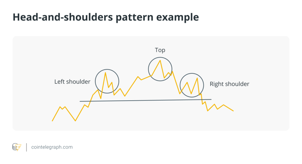
Description: The head-and-shoulders pattern is a reversal pattern that can signal a change in trend direction. It consists of three peaks: a higher peak (head) and two lower peaks (shoulders).
Formation:
- Left shoulder:A peak followed by a decline.
- Head:A higher peak followed by a decline.
- Right shoulder:Another peak, roughly equal to the left shoulder, followed by a decline.
This pattern typically signals a bearish reversal after an uptrend. A break below the neckline (the line connecting the lows of the left shoulder and the right shoulder) confirms the pattern, suggesting a potential sell signal.
Double tops and bottoms
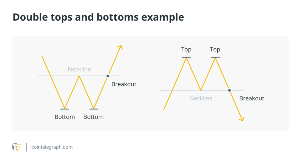
Description: Double tops and bottoms are reversal patterns that indicate a change in the trend direction.
Formation:
- Double top:Forms after an uptrend, characterized by two peaks at roughly the same level.
- Double bottom:Forms after a downtrend, characterized by two troughs at roughly the same level.
- Double top:Price rises to a peak, retraces, rises again to a similar peak, and then declines.
- Double bottom:Price falls to a trough, rebounds, falls again to a similar trough, and then rises.
A double top signals a bearish reversal, while a double bottom signals a bullish reversal. Confirmation occurs when the price breaks below the support level (for double tops) or above the resistance level (for double bottoms).
Triangles
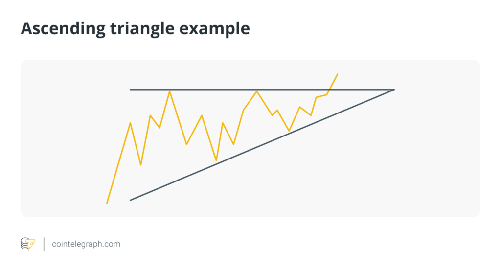
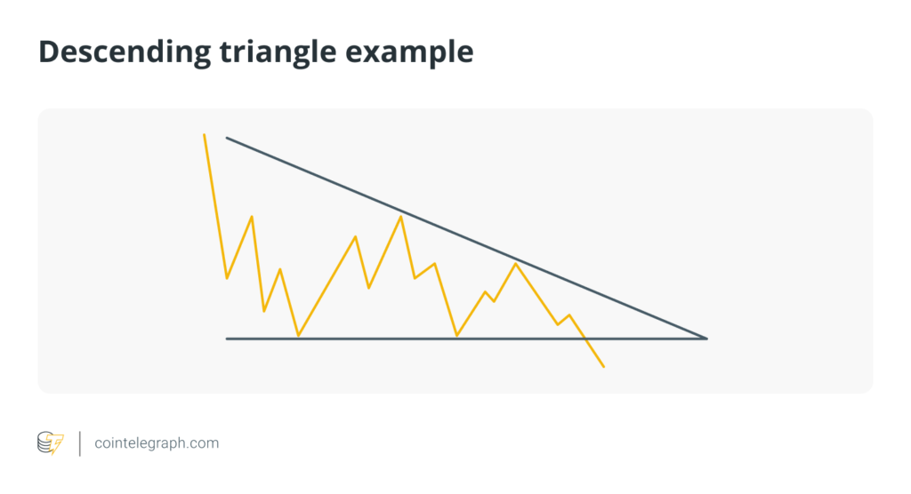
Triangles are continuation patterns that suggest the price will likely continue in the same direction once the pattern is completed. There are three main types of triangles: ascending, descending and symmetrical.
Ascending triangle
- Description:Has a horizontal resistance line and an upward-sloping support line.
- Formation:Price makes higher lows but meets resistance at the same level.
- Usage:Indicates a bullish trend. A break above the resistance line confirms the pattern.
Descending triangle
- Description:Has a horizontal support line and a downward-sloping resistance line.
- Formation: Price makes lower highs but finds support at the same level.
- Usage:Indicates a bearish trend. A break below the support line confirms the pattern.
Symmetrical triangle
- Description:Has converging support and resistance lines.
- Formation:Price moves between upward and downward-sloping trend lines that converge.
- Usage:Indicates a continuation of the current trend. A break in the direction of the existing trend confirms the pattern.
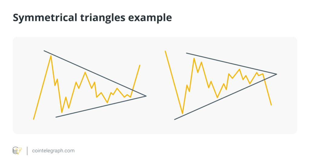
Simply put, triangles help traders predict that the price will continue moving in the current trend direction, with each type of triangle providing different signals for bullish or bearish trends.
Tips for identifying trading patterns
- Patience and practice: Recognizing patterns takes time and practice. Continuously analyze charts to become more proficient.
- Use multiple timeframes: Confirm patterns by checking multiple timeframes. A pattern visible on multiple timeframes tends to be more reliable.
- Combine with indicators:Use technical indicators to confirm the patterns. For example, combining volume analysis with pattern recognition can provide additional confirmation.
- Risk management:Always implement risk management strategies, such as setting stop-loss orders, when trading based on chart patterns to protect against false signals.
By mastering these patterns, you can gain valuable insights into potential price movements and enhance your trading strategy.
Did you know?
The concept of using charts to identify patterns in financial markets dates back to the early 20th century? Charles Dow, co-founder of Dow Jones & Company and The Wall Street Journal, developed theories about market movements that laid the groundwork for modern technical analysis. When you spot patterns like head and shoulders, double tops and bottoms and triangles, you’re using techniques that have been evolving for over a century!
5 Practical tips for reading cryptocurrency charts
- Choosing the right charting platform
Selecting a robust charting platform is crucial for effective analysis. Popular platforms like TradingView and the native charting tools on exchanges such as Binance and Bybit offer comprehensive features. Look for platforms that provide a wide range of indicators, drawing tools and customization options.
- Combine indicators, but avoid clutter
Using multiple indicators complementing one another can provide a more comprehensive view of the market. For example, combining a trend indicator like a moving average with a momentum indicator like RSI can give a clearer signal than using two similar indicators.
However, ensure that your chart is clean and uncluttered to avoid confusion. Using too many indicators at once can overwhelm and obscure critical price information.
- Fully utilize chart customization options
Customize the chart’s appearance to make it easier to read. Many charting platforms like TradingView will allow you to adjust the colors of the candles, the background and the gridlines to suit your preferences. Ensure that your chosen colors enhance readability and do not cause strain over long periods of analysis.
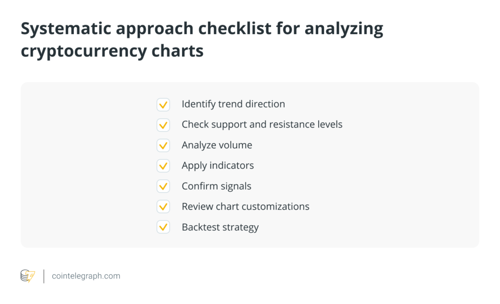
- Use a systematic approach
Develop a checklist or a set of rules for analyzing charts. This could include steps like identifying the trend direction, checking for support and resistance levels, analyzing volume and using indicators to confirm signals.
- Backtesting strategies with historical data
Backtesting involves using historical price data, volume data and other relevant market information to simulate how a trading strategy would have executed trades in the past.
Before implementing any trading strategy, backtest it using historical data. Most charting platforms allow you to replay past market conditions. This helps you understand how your strategy would have performed in different market scenarios and refine it before applying it to live trading.
Written by Bradley Peak
